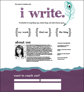
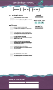
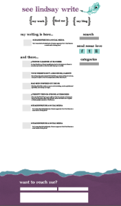
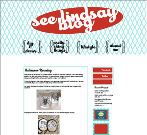
As you know, I’m in the (very sloooow) process of designing my new website and blahhhg. Below are screenshots of the designs thus far… what do you think? Comments, criticisms and praises welcome!
ETA: I’ll be using both designs (the peacock and the retro). The peacock theme will be for my more professional site at lindsaygoldner.com, and then the blog will be linked to from there but might eventually have its own domain. I like the retro design on the blog, since it’ll be more diy/decor/design focused!
Soooo… what do you think so far?


Oct 09, 2010 @ 19:54:48
I really like the first one “i write.” and then the first version of the Level 2 page. I love purple and turquoise together. You did a great job.
I’m having my blog designed and hoping to have it up sometime this week.
Oct 09, 2010 @ 20:22:34
I like the first one, too! It stuck out to me immediately! Great job!
Oct 09, 2010 @ 21:06:20
Thanks! I like that the two sites show diff sides of my personality too 🙂
Oct 10, 2010 @ 07:50:15
Lindsay,
Great design! I have a few suggestions, though. . .
The font used for “i write” isn’t my favorite. I feel like it doesn’t really match with the rest of the style you’re going for. Perhaps try Chunk Five or Devroye
http://www.fontsquirrel.com/fonts/ChunkFive
http://www.fontsquirrel.com/fonts/Devroye
They’re cleaner & it might just be a tad more cohesive. I would also consider centering the text “My name is Lindsay and”; it just seems a tad imbalanced. I would also bring the tagline underneath “i write” up a tad. It’s floating a little bit.
I like the first version of the level 2 page. The torn paper on top & bottom looks nice. I would just move everything in the white space down a bit. It’s sorta crowding the torn edge up top.
The vintage layout is cool, but I would consider changing colors to either the same ones or slightly lighter than the peacock design so people can see the connection in your overall brand. I would also center the text within the boxes & make the strokes smaller. I know this is a little nit-picky, but you’ve got a little issue between the O & G in “blog” in your header. I would change that little inner shape white. Make the O & G connect.
There you have it. The designs are great, but perhaps need a few slight tweaks. I love the peacock feather!
Cheers.
Oct 10, 2010 @ 09:32:33
Thanks M! I’ll try it out with those fonts later and then post em.
I’m still wrestling with the blog… it sucks, because I LOVE teal and red together and wanted to do that on my “I write” site but i felt like that wasn’t professional enough. I’ll try it out with the peacock colors… wonder if I could implement the teal/red on the main page instead? Oiy, that’s a lot of work haha.
Thanks for the compliment on the feather, although sadly, I can’t claim credit for it. My awesome boss whipped it up for me. And thanks for your input. I’m totally struggling with this project!!
Oct 10, 2010 @ 09:03:14
I like the second one a lot!
Question: I’m gonna be starting a Boston bloggers blog sometime in the near future and I’m looking for ladies who’d want to post… Wouldja be interested? 🙂